J Herbin 1670 Turquoise De Perse Bottled Ink
Turquoise is such a fascinating color. Whether you enjoy seeing this lighter blue color in your pens or inks, turquoise is mesmerizing. You can get lost in its depths. And considering so many things are made with turquoise as a color option (even outside of the pen community), it’s no surprise when we get even more options to use turquoise. In this case, J. Herbin brings a new color with the J Herbin 1670 Turquoise De Perse Bottled Ink.

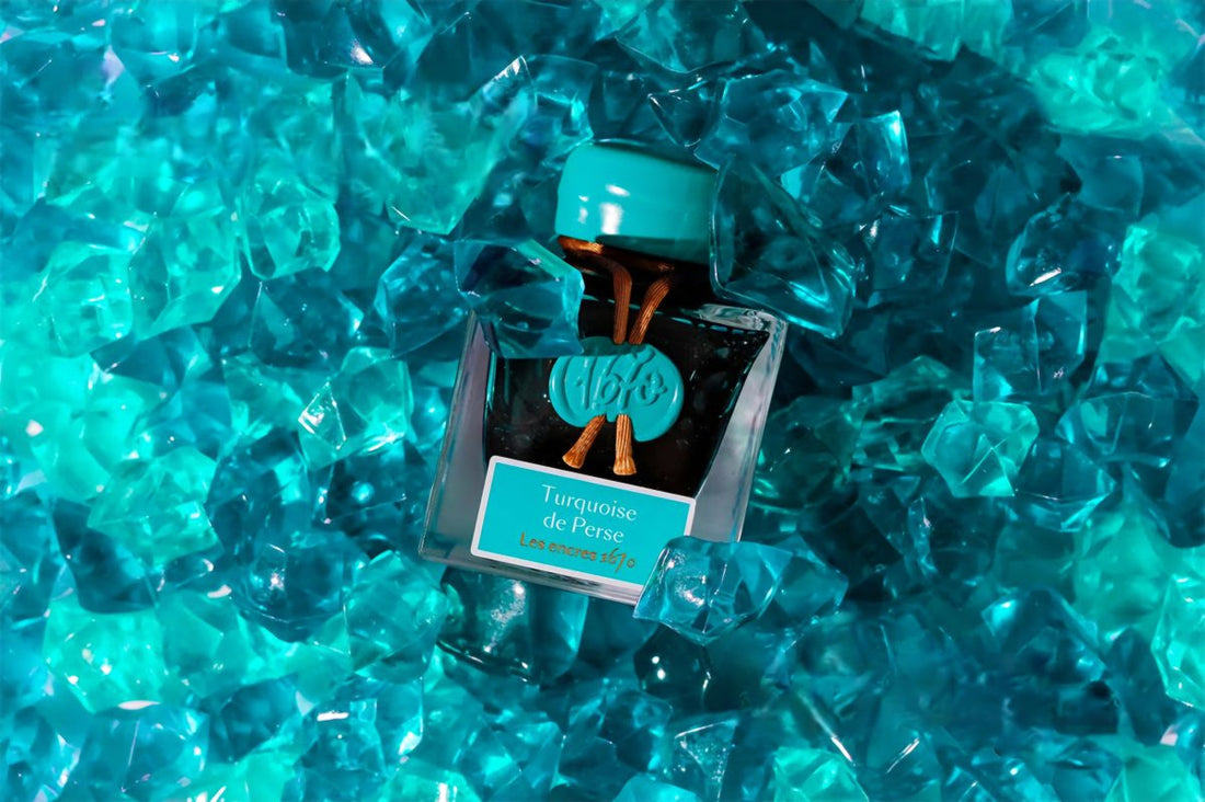
First of all, J. Herbin’s 1670 inks commemorate the year that the Jacques Herbin company was founded in the heart of Paris. This year’s addition to the 1670 Collection is Turquoise de Perse. Notably, the J Herbin 1670 Turquoise De Perse Bottled Ink is inspired by the blue-green tones of genuine turquoise.

Secondly, this rich, vivid color is elevated by the addition of a dazzling gold sheen. As with all J. Herbin 1670 inks, we get to experience this turquoise highlighted by the built-in glitter effect. Turquoise de Perse creates a unique and beautiful writing experience, adding a touch of glamour to your missives, memos, and correspondence.

This year marks a new milestone in the prestigious history of Jacques Herbin with the latest addition to the emblematic 1670 Anniversary ink collection: Turquoise de Perse. True to the tradition of excellence that built the reputation of the French house since 1670, the ink captivates with its unique brilliance.

Above all, the Turquoise de Perse fountain pen ink stands out with its fascinating blend of blue-green tones. It’s inspired by the eponymous gemstone. Moreover, this liquid jewel is sprinkled with golden shimmer. Therefore, see it create a luminous effect that turns every stroke into a sparkling work of art. Whether for a handwritten letter, a special invitation, or a creative project, this ink enhances writings with a touch of magic.
Finally, its fresh brilliance and depth make this ink an ideal choice for those who wish to add a touch of light and originality to their writing. Jacques Herbin’s Turquoise de Perse is more than just an ink. It’s a sensory experience that combines historical elegance with modernity.