Private Reserve 2 Minutes To Midnight Blue Ink
For those of you who may not know this, Ken Jones of Yafa Pen Company loves to rock out to Iron Maiden. He’s a huge fan of their music. You can see his steady hand capturing video of their concerts he attends. Therefore when I saw the name of Private Reserve’s new limited edition ink, I knew it had to be with Ken’s influence. The Private Reserve 2 Minutes To Midnight Blue Ink is a wonderful, dark shade of blue. Its name is very similar to the Iron Maiden song, “2 Minutes To Midnight”.


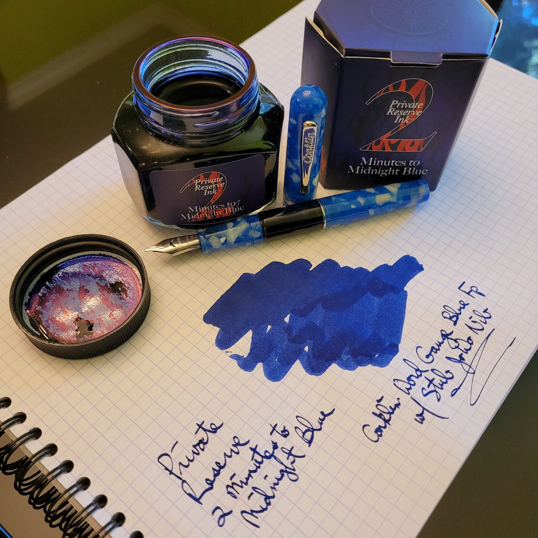
First of all, I find it interesting that there’s no mention of the song on the box. Instead, the description reads: “It’s almost midnight and you find yourself looking at the stars, recording the day’s events with a favorite pen. Special days are best remembered in color, one that jumps from the page. Private Reserve Inks is proud to announce our first limited edition ink: Private Reserve 2 Minutes To Midnight Blue Ink. Packed in a special 110mL bottle, only 1,100 pieces of this unique pantone color will ever be produced. Reach for this star before time runs out!”. Well, that’s a lot of great information packed into a small space on the box.


Secondly, I like the unique bottle shape. It’s a larger size due to the 110mL of ink it contains, and the hexagonal shape is easy to hold. There’s a sticker of a clock on top of the cap, with the time pointing to (you guessed it) 2 Minutes To Midnight.
Thirdly, the dark blue color really does resemble the nighttime sky. As you can see in the pictures, I filled my Conklin Word Gauge Blue fountain pen with this ink. I love the way it matches too. This Private Reserve 2 Minutes To Midnight Blue Ink really does jump from the page as they suggest.
Finally, with so many great blue inks out there to choose from, I like how this really does stand apart. It’s a rich, deep blue with shading properties. When I wrote with it, this ink flowed easily onto my Rhodia pad of paper. My words don’t do this ink justice with how great it is, so hopefully these pictures have captured the quality of this ink’s color.