Esterbrook JR Pocket Fountain Pen
When I first saw pictures of the new Esterbrook JR Pocket Fountain Pen, I quickly dismissed it and was not impressed. I thought the idea of bringing back a model of a vintage Esterbrook fountain pen was just not that exciting. Especially since I’m not a fan of lever-fill fountain pens, and the original was exactly that – a lever-filler. So, when it came time to examine the pen more carefully as I added to Bert’s website, I admitted that perhaps I dismissed this pen too quickly. Only after “borrowing” a sample Esterbrook JR Pocket Fountain Pen that Bert had on-hand, did I immediately do a quick 180°, and bought one for myself!

All I can say is that the new Esterbrook JR’s are like night and day compared to their predecessors. Everything from the colors, size, shape, filling system, even how thick the resin is, and lastly the nib and feed are completely different.
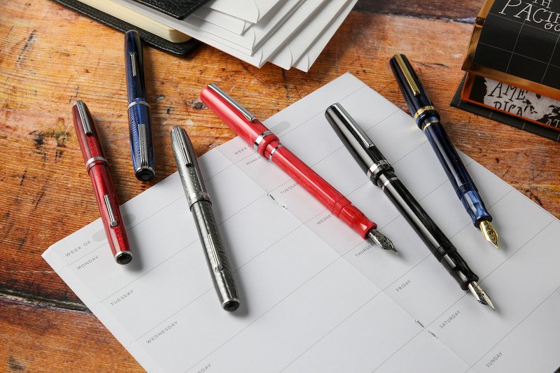
The colors are similar, but these new ones are definitely upgraded. From the moment I held all three colors (Capri Blue, Carmine Red, and Tuxedo Black), I was drawn to the Carmine Red. All three colors are exquisite and have a shiny, marbled finish, but I felt that one really stood out. And I quickly imagined what the line that the broad nib it housed would look like. I took it home with a few other fun “goodies” from Bert’s store, and couldn’t wait to fill it. Going through all my inks in the red range, I selected Monteverde’s Sweetlife Cherry Danish to match perfectly. As usual with new fountain pens, I gathered my Rhodia #16 Dotpad for testing.

Since the Esterbrook JR Pocket Fountain Pen uses a cartridge/converter filling system (and not a lever filling system of yesteryear), I was able to fill the pen with ease. And the moment the nib touched down onto paper, it glided smooth-as-butter (to borrow one of Bert’s phrases). The ink flowed perfectly without issue. There was no hard-start as some new pens experience. Using the German JoWo nib was a smart decision for Esterbrook to go with.

The JR is a little bit thicker, a little bigger (measuring 5” long capped), and more curvaceous than its predecessor. The clip is similar, yet has a thinner width, thicker depth, and comparable length. All of which makes the clip feel more durable. Notably, the Carmine Red and Tuxedo Black have chrome trim, while the Capri Blue uses gold trim. As for the pen itself, I always felt like the original vintage resin was so thin that I’d crunch it in my hand when writing. This one feels like it’s crafted from such a solid block of resin, and is so much thicker that it can withstand my enthusiastic writing at times.

As Esterbrook is known for having a wide range of nib options, the new version follows suit. Choose from extra fine, fine, medium, broad, and stub 1.1 (all are steel nibs). I feel like you can’t go wrong no matter which nib size you choose. Last but not least, they get special mention for including a large polishing cloth. I think that’s a classy touch. And very cool that it’s a darker red with the Esterbrook logo, like the inner lining of the new Esterbrook Navy Nook Pen Cases (see my review here).

What do you think? Do you have yours yet? You can check it out here.
Do you like what you’re reading? Subscribe to our blog to sign up for our monthly giveaway!